iPrint Digital - Branding

Helping a new local business pledge success and growth through a bold identity.

Context

Context

iPrint Digital Production Printers is a local dealership of trusted brands such as Sharp and Fujifilm, selling printers, scanners, and office solutions to businesses, institutions, and government offices. As a new entrant, they needed a strong identity that reflected their promise of customer care, success, and growth while integrating their initials “i” and “P.”

Design Arcade is my thesis project — an interactive platform where students and young professionals practice design principles through play. This case study focuses on how I built a brand identity that bridges the excitement of arcade culture with the credibility of design education.

Deliverables: Logo System, Color Palette, Typography, Mockups, Brand Guidelines

Scope

Logo design

Social media template

Stationery design

Timeline

1 Day

Check Out More

Challenge

Context

To design a professional logo in just one day that not only incorporated brand initials (i, P) but also visually communicated the client’s values of promise, pledge, and growth. The identity had to feel modern, trustworthy, and scalable across stationery and digital channels.

Design Arcade is my thesis project — an interactive platform where students and young professionals practice design principles through play. This case study focuses on how I built a brand identity that bridges the excitement of arcade culture with the credibility of design education.

Deliverables: Logo System, Color Palette, Typography, Mockups, Brand Guidelines

Research & Insight
Design Development
Application

Conducted a quick competitive scan of local printer dealerships to understand the visual language in the industry and identified a gap: most local competitors lacked a symbolic and values-driven identity.

Brainstormed directly with the client in a live working session for real-time feedback.

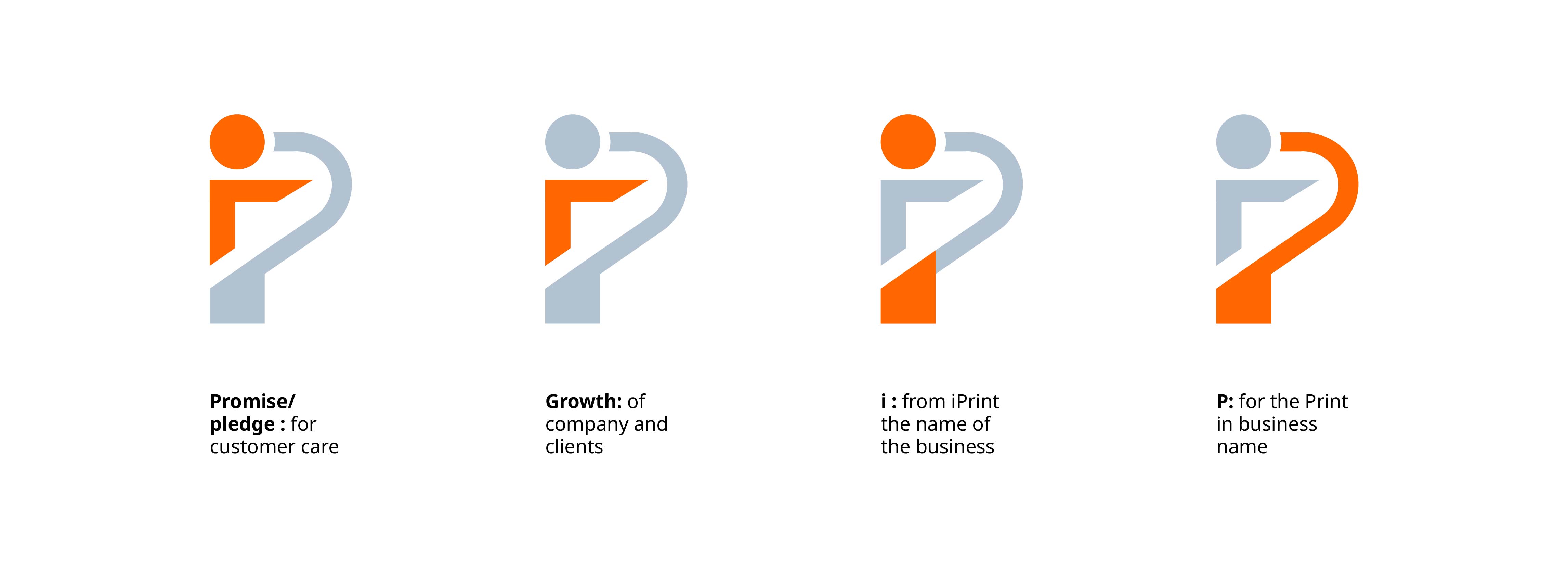
Built the logo around four symbolic layers:

  • Promise/Pledge - customer care

  • Growth - upward trajectory for clients & business

  • i - for the brand name iPrint

  • P - for “Print” in business name

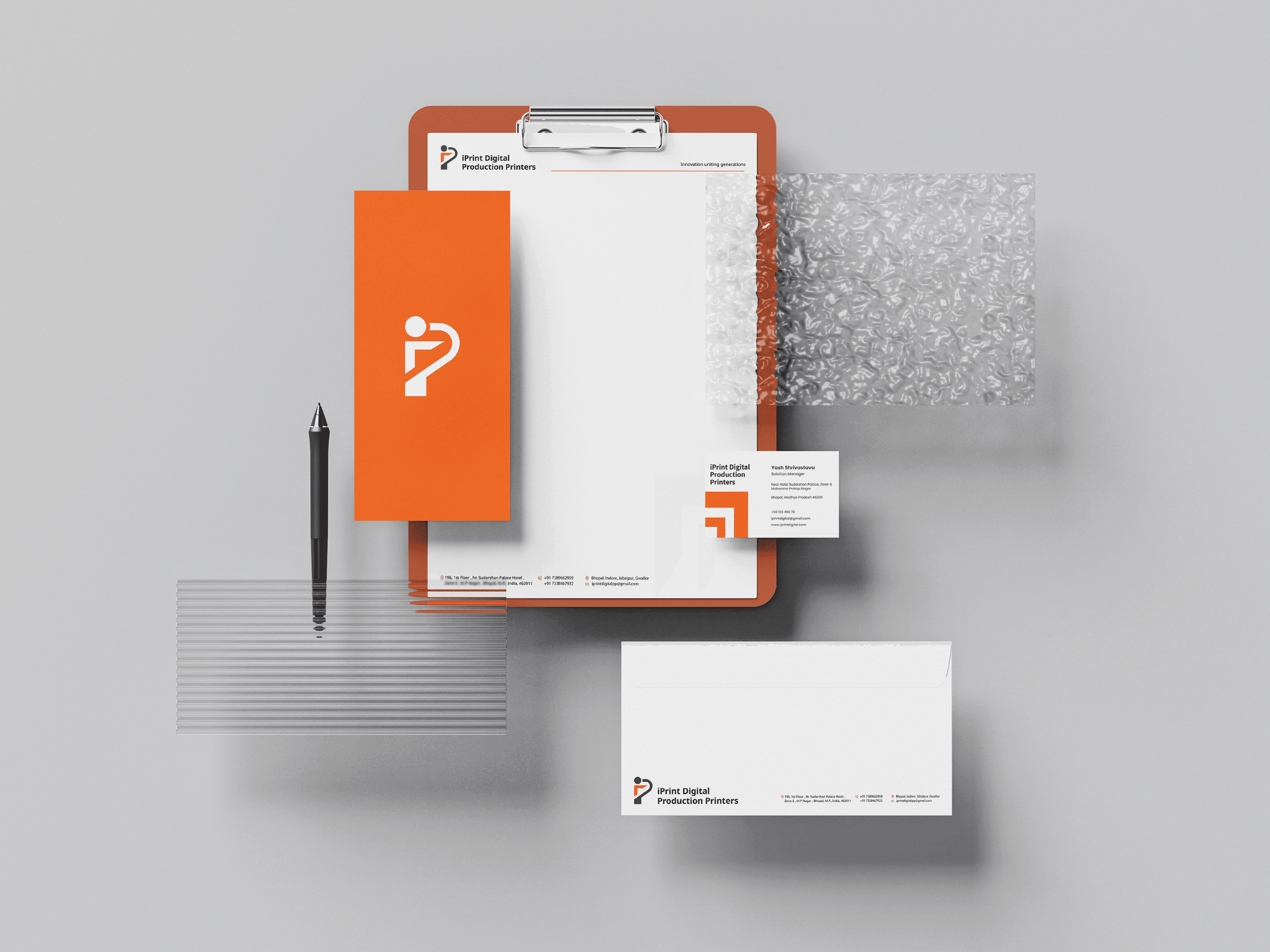
Chose a bold navy blue for trust and professionalism, paired with vibrant orange to represent energy, progress, and success.

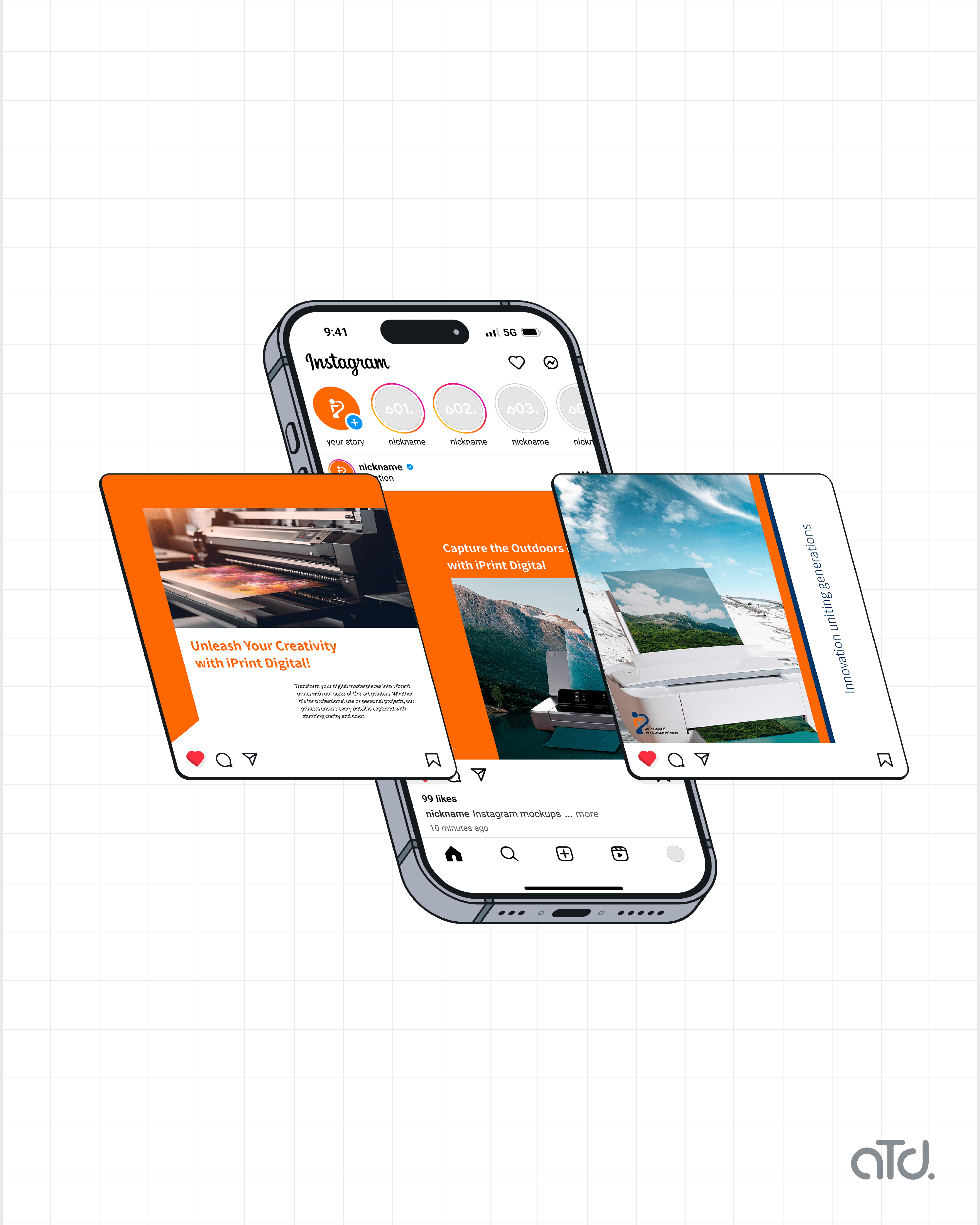
Adapted the logo into stationery and social media templates.

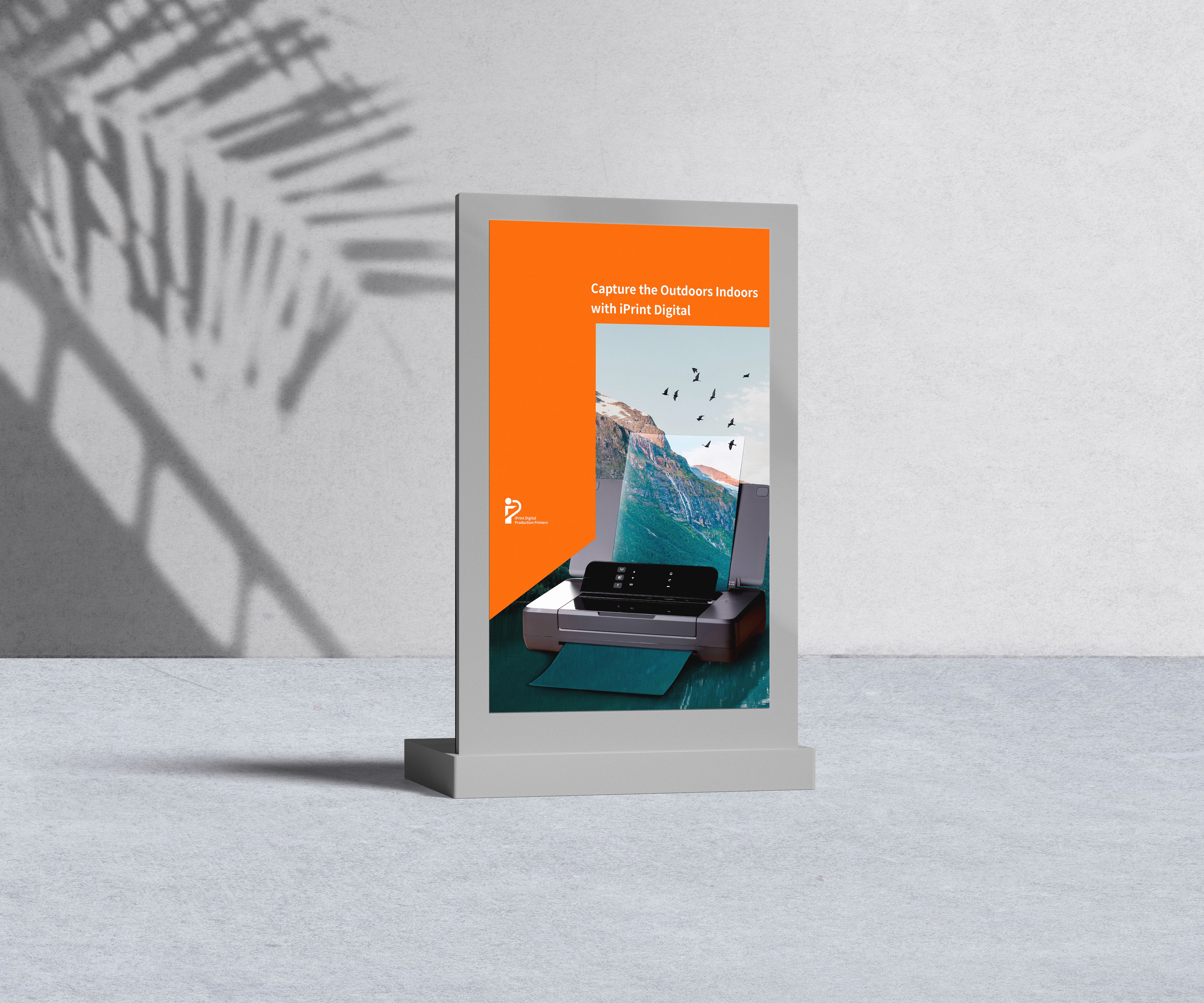
Ensured scalability across both print and digital formats.

Outcome

The final logo symbolized partnership, growth, and customer success, while subtly embedding the initials “i” and “P.” The client was thrilled with the result, as it perfectly aligned with their values and helped them establish a professional presence from day one.

Role

Branding Designer

Stack

Illustrator

Photoshop

Deliverables

Logo system

Stationery design

Social media templates